- cross-posted to:
- coolguides@lemmit.online
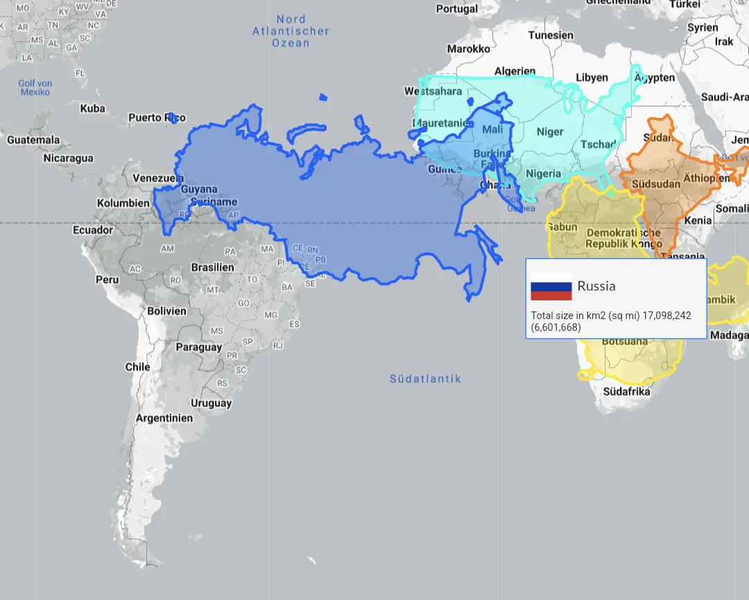
Russia looks Mercator’d. Would be better if they’ picked a projection to get a truer shape of Russia to overlay.
Canada?
30Mm2 is dam large.
Comparing a continent against countries…
How is this supposed to be informative?
Was going to say the same thing. How’s north America compare.
Right? This isn’t a good one
It’s of course totally accidental that the Mercator projection was chosen for the world map, that makes Africa look much smaller compared to other countries.
I thought it was because of its use in with constant straight lines and angles could be used for travel
In talking about the world map specifically. Nobody would use that for plotting a course.
I can only go by what these articles claim—that that projection is used for plotting/planning. https://www.britannica.com/science/Mercator-projection
Good thing Africa is a continent


