I found this searching for information on how to program for the old Commodore Amiga’s HAM (Hold And Modify) video mode and you gotta touch and feel this one to sneer at it, cause I haven’t seen a website this aggressively shitty since Flash died. the content isn’t even worth quoting as it’s just LLM-generated bullshit meant to SEO this shit site into the top result for an existing term (which worked), but just clicking around and scrolling on this site will expose you to an incredible density of laggy, broken full screen animations that take way too long to complete and block reading content until they’re done, alongside a long list of other good design sense violations (find your favorites!)
bonus sneer
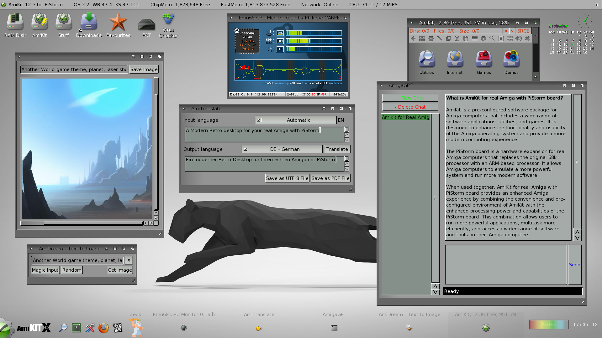
arguably I’m finally taking up Amiga programming as an escape from all this AI bullshit. well fuck me I guess cause here’s one of the vultures in the retrocomputing space selling an enshittified (and very ugly) version of AmigaOS with a ChatGPT app and an AI art generator, cause not even operating on a 30 year old computer will spare me this bullshit:

like fuck man, all I want to do is trick a video chipset from 1985 into making pretty colors. am I seriously gonna have to barge screaming into another German demoscene IRC channel?


A few select snarks:
check out their main page, cause it gets so much worse
also did you notice that on load every page does a fake loading-style animation regardless of whether or not everything is already in cache? they somehow ported Flash’s loading jank into CSS and I fucking love it. this is the kind of talent we need to reskin awful.systems
did you see the home page? It loads a splash animation of their shitty logo before revealing the content. Immersive!
I only just noticed this is the website for a digital agency. It makes a bit more sense in that context. It’s not right, but it’s the kind of stuff that suits sell to suits who think people love their product so much that they want a scrollytelling* experience to learn more about it
*I learned this word last week and I love it so much - chef’s kiss coporate marketing delusion
I remember when the 2000’s pages did this, and all in flash. There used to be an HR Giger inspired one where the inferface also made noises. “Time to click a link” Link squelches
If there ever was a purpose for Flash on the web…
p.s. your “Link squelches” makes me want to watch eXistenZ
the shift from the hamburger menu is because the scrollbar disappears. They could easily fix this by making the
:root {width: 100dvw}which makes it 100% dynamic width - meaning it ignores browser elements like scrollbars.but the site is drupal so there’s a good chance this is a modified theme
I don’t want it fixed. It’s perfect as is