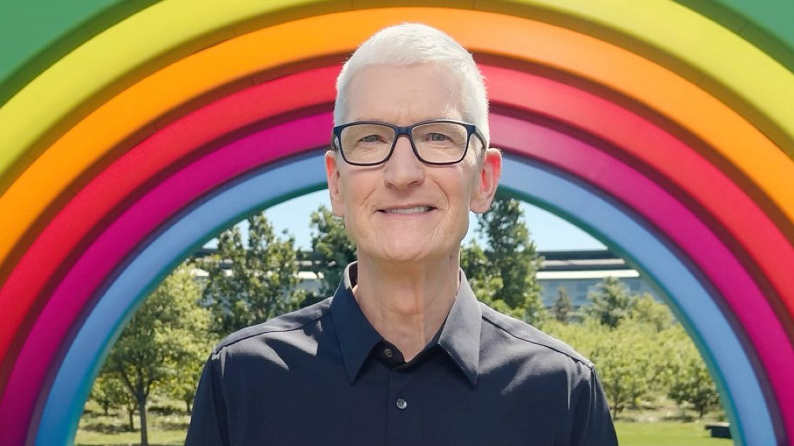
Apple CEO Tim Cook is stepping down as Apple's chief executive officer, and hardware engineering chief John Ternus is set to take over, Apple announced today. Cook will continue on as Apple CEO through the summer, with Ternus set to join Apple's Board of Directors and take over as CEO on September 1, 2026. Cook is going to transition to executive chairman, and he will "assist with certain aspects of the company, including engaging with policymakers around the world".
I’ve only used it in passing when somebody’s handed me their phone to put my number in or something but I think the big objection is not what it looks like but it’s usability or lack thereof.
Why would I want my user interface to be transparent, isn’t the whole point that I need to be able to see the interface surely I want it to stand out from the background.
The other complaint is that the analogy doesn’t really work, glass isn’t a liquid substance, so why does it make sense for the sliding toggle to morph?
The transparent theme is just one of several settings for it, and that it idiotic, but the normal mode when it adds a bit of gloss and texture to the icons is great