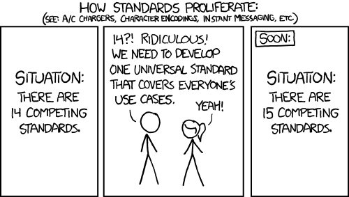
What are your wackiest ideas for a “universal” controller layout that would appeal to the fans of the Xbox, Nintendo, and PS layouts? You certainly can’t pick one of the three, that would be lazy and frankly unfair for the other two layouts. It’s got to be something that everyone agrees on, something different!
I’ve got a few ideas: NSEW (the cardinal directions), RGBA (colours, also transparent button could be cool…), or maybe CMYK (printer ink colours for ease of printing)
What are your ideas for the universal controller layout?
I always thought the colors were dumb. Imo this is what the color scheme should be:
A/Circle=Green=Accept=Go
X=Red=Cancel=Stop
B=Blue
Y=Yellow
Put them wherever you want lol and I guess square feels blue and triangle feels yellow (kinda looks like an upside down y and a y has 3 points). It also satisfies the original intent for ps buttons without being confusing since x and circle are represented with the commonly known colors for those things. I personally prefer the asymmetrical Xbox stick/button layout.
And actually now that I’m thinking about it it’d be kinda cool if the triangle was flipped and the square had a horizontal line through it, then circle could be like a lower case a. Then you have both ps AND Nintendo/Xbox labels XD
Ouch, my career
X on the right so nobody is happy
Introduce ‘Ω’ button
placed in the center of the dpad
wipes and restarts connected device on press
touch sensitive
It already exists.

The Steam Controller was perfection.
People don’t want to hear it. But you are right.
Bring back octagonal gated analog sticks.
I mean, I’d go back to Sega-style six button layouts.
Also, leverless controllers. Better for your hands, more effective. The one example I’ve seen of adding dual sticks to those is… not going to replace pads for 3D games any time soon, though.
I think for the button layout, if you keep the cross shape you can do directions (up/down/left/right). NSEW could work. Ultimately, though, the most rational one is Xbox and the most universal is PlayStation (in that it doesn’t rely on a specific script). Frankly, at this point Nintendo’s “we give up” solution of showing four dots with the relevant one highlighted may be the only way to fix this whole situation.
Also, also, D-pad above forever. Only valid choice. Fight me.
I like PS glyphs because they are language-neutral and look more distinct, and I think, it would be point one in my choice. Point two is color-coding that helps most people (but may adjustments for accessibility?). Point three although ofercomplicating things is direction-coding, as it’d be generally nice to have a > shape near them, so they’d read intuitively from the first playthrough.
My initial thought went for second set of arrows. Like d-pad has one kind ⬆️➡️⬇️⬅️ and buttons have the other 🔼▶️🔽◀️. But I doubt it would be consisntetly great in different games with their own visual approach to portraying them.
Having more direct sign buttons on the other hand ✅️❌️❓️❕️ may be limiting to what devs want their game to be as it implies the check button is always approval, etc.
Math symbols, tho, ✖️➕️➖️➗️🟰 can be a universal and neutral set to pick from, especially if avoiding the confusing X button.
Also, ♤♡◇♧, in connection with older modes of gaming, but it should be tested for illegebitility between them and compared to arrows as three of them have vagualy triangular shape.
Also loss buttons.
I like the suits!
I know OP’s rules say no picking one of the three already, but these are such good points I can’t help but agree. I’m also biased from years of using a PlayStation controller. Even though I haven’t owned a PS console since PS2, I’ve still been using the PS4 & 5 controllers for PC gaming.
I think legibility and avoiding overloading symbols is top priority and the PlayStation glyphs achieve this admirably. On a pettier note, I’ve never liked seeing a prompt with a big, red B button pop up on screen telling me to do something, it’s very immersion breaking. While the PlayStation prompts aren’t exactly diegetic themselves, they’re at least less non-diegetic I guess, if that makes sense?
I won’t argue symmetry vs. non-symmetry of control sticks as I don’t really think there’s a correct answer here, it’s very preferential. I obviously prefer the symmetric, but I think there’s a reason the DualShock has undergone only minor changes since it was first introduced in check notes 1997?! JFC, that’s almost 30 years …
That’s immersion 🅱️reaking, lol.
I vouch for symmetry, or rather important buttons not being placed on the bottom. Active movements and especially button presses, e.g. in QTEs or multiple menus, are rather uncomfortable there, while sticks employ a different and less demanding moveset of slightly tilting them to the side. I don’t see a reason why it’s assymetrical on Xbox and I feel it’s really dumb in autonomous Joycons with Nintendo party games when they should be completely interchangeable when shared between casual gaming persons.
Everyone could learn a thing or two from the Steamdeck. The twin sticks, the touch pads, the double shoulder buttons, the four on the back, the overall ergonomics, it’s really great to use.
It would never catch on, cause people don’t like change :p
But if there was one, it’d probably make sense to go with directions/arrows (←↑↓→) it’d be the least amount of memorization, since everyone from every language can guess that the button you need is the one at the tip of the point in the picture
Those might get mistaken for directional buttons. I had the same thought. Maybe I triangle with the point in the direction of the button, but you may run into the same issue.
I think to avoid that, it might be easiest to just show the four button layout with the correct button highlighted.
That too :3
But any symbols you choose to put on the buttons themselves are gonna be arbitrary mostly
This is what Nintendo does on the Switch when the sideways joycon is supported and it works well. It may break the OP’s rules, though.
a modular controller with options for steamcontroller pads. 2 joysticks. 2 dpads. 2 sets of 4 buttons. still got triggers and paddles and every thing is customizable.
cool, but I would imagine the controller to be pretty chonk
if its modular you can add and remove bits. plus you can 3d print the opensource parts so it can be as chonk or as smol as you like
THAT would be cool
Whatever the layout, bring back the Dreamcast VMU. Maybe we don’t need the external memory anymore, but the little display with extra game details was so cool.
One joystick, two buttons.
Mr fancy pants over here with his two buttons
Not sure who you’re talking about, I’m wearing my smarty pants.
as someone who has never had a playstation, knowing now the original semantic meanings of the playstation glyps i think they’re the best compromise IF we go back to their original meanings. they had it right the first time with hlw intuitive it is to have O being confirm and X being cancel, and it’d keep Nintendo people somewhat happy because confirm is still the far right button. maybe they could also release a version with reversed or hotswappable buttons, using the current PS layout (which in this case would be O on the bottom and X on the right) to throw a bone to the xbox crowd because this compromise doesn’t do anything for them otherwise
or like another commenter suggested, we throw out the diamond button layout, too tainted by the competing standards of the console wars, and use the gamecube layout like God intended
X-inverted c-stick southpaw


