
This is a weird one. Bear with me. From !dataisbeautiful@lemmygrad.ml:
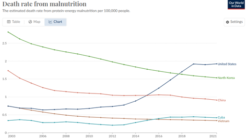
So I said to myself, “that’s a little bit weird. The US one going up, I can actually believe, but the North Korea one being lower is definitely wrong.”
I think Our World In Data is just being shoddy, as they often do.
https://www.wfp.org/countries/democratic-peoples-republic-korea
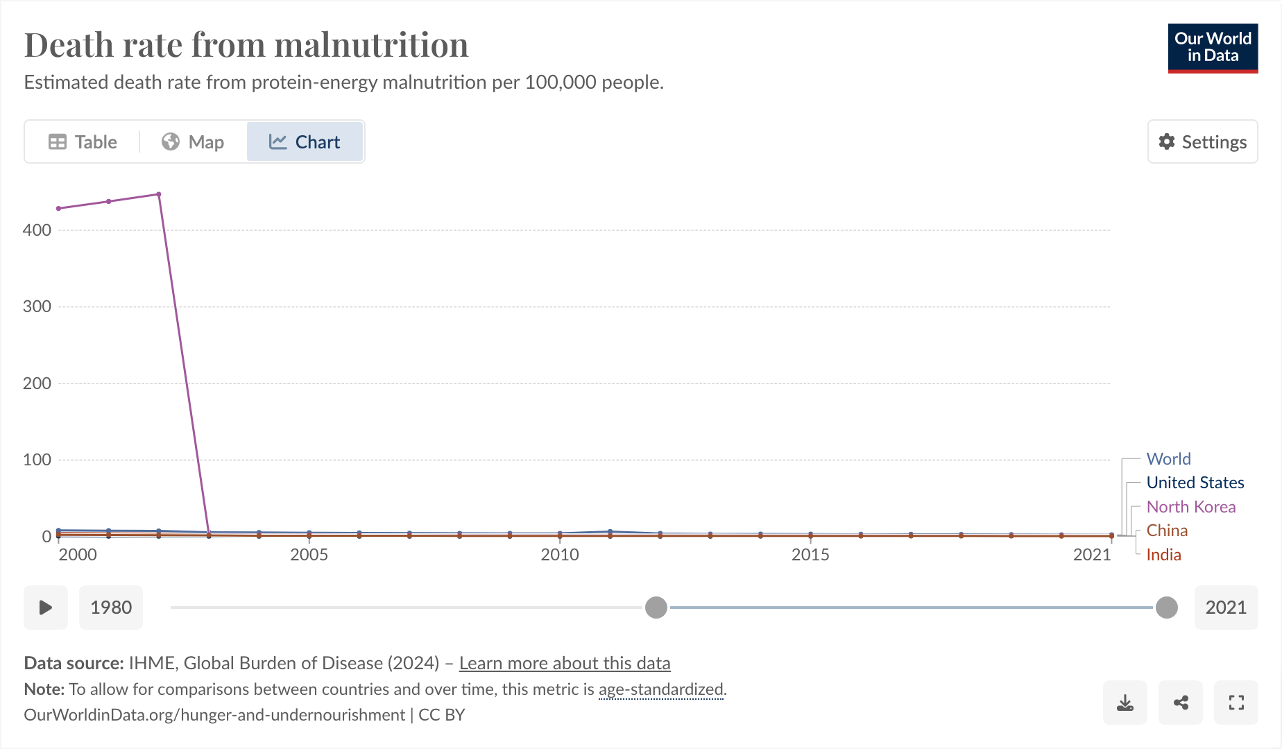
The thing I found funny, and why I’m posting here, comes from observing why it was that they started their graph at 2003 and exactly at 2003.
I feel like you could use this as a slide in a little seminar in “how to curate your data until it matches your conclusion, instead of the other way around.”
And also, I don’t think the hunger rate suddenly dropped from epic to 0 exactly in 2003, I think more likely Our World in Data is just a little bit shoddy about their data.
If you’re not reading this guy’s profile, you’re missing out. Search for “radiation.”
I like how this guy acts like his crazy beliefs are just obvious information everyone should know
Removed by mod
So you recognize your colleague from the other side huh?
Removed by mod
that adds up, your comments certainly have zero value.
Removed by mod
you can’t chew gum and type at the same time without risk of choking to death. we get it.
my god, what a pointless and petty existence you must have, whining and moaning to get attention on the internet from people who genuinely despise you.
Removed by mod
Yep, just another day in Eglin.
Removed by mod