- cross-posted to:
- android@lemdro.id
- cross-posted to:
- android@lemdro.id
I really hate the term “side-loading.” We shouldn’t need a word for the normal way we’ve been installing apps for the past 40 years. If tomorrow Apple decided they were going to start only letting you visit web pages they approved of, we wouldn’t call some sort of alternating system that let you see the rest of the fucking internet “side-paging”. We’d instead call the whole thing bullshit.
Until some time ago, I always though that “side-loading” is something different. Since I first saw “side-loading” used in ADB, so I thought that it means using another system on the side to load and install software onto a target system.
So to me that seems fitting, but now it seems to be used differently. How is installing software using just one device “side-loading”. What side do they mean?
I’ve always took side-loading to mean installing from local storage, as opposed to downloading from remote storage. As far as I’m concerned downloading from a third party app store should not be treated as side-loading.
But to install from local storage, you first download or fetch a storage medium from a remote location with the file on it. There isn’t that much of a difference IMO.
I would not call it side-loading when I download a file and then install it on the same device. Because that is how it has always worked. I never before heard people describing downloading and executing a setup.exe as “side-loading”.
Fair points. I was mostly thinking of situations like downloading using a separate device, writing to a usb drive or SD card and installing via that. Downloading an installer and using it is just downloading without using an app store.
All Android phones block side loading by default, do they not?
But it also shows you a button to go straight to the toggle that lets you enable it when you try to install an app
I really don’t mind that they hide the button to enable installs from .APK when they are being directly downloaded. It has been in my opinion very bad idea from the beginning that it shows that, it has enabled multiple malwares in android. Non-technical people should not have easy way to install things, even with big warnings, because people ignore warnings.
If google removes the ability to install non-store apps all together, then that day I will stop using Android.
deleted by creator
wasn’t it always blocked by default? Google’s always given a scare alert on sideloading apps, is this just an additional popup or is it replacing the stock one. Seems rather pointless if a setting and a waste of developer’s resources if you ask me.
My phone randomly started quarantining basically every app that wasn’t from the play store after my last update, annoying as hell.
That is super obnoxious, but I don’t think it was supposed to do that judging by the article it’s supposed to keep your existing settings it wasn’t supposed to be forced on
So you need to change two settings instead of one to side load. Seems rather pointless.
Big difference is that that one setting was shown to you with a button press when you tried to install an app. With this, you need to remember or make a screenshot of where you need to go, open the settings app and then go there and toggle it on. It’s just a lot more annoying to do and Samsung probably hopes that that will deter people from doing it.
Just standard corporate dark patterns
Screenshot? What are you, a goldfish?
…Why? What’s the point? What do they possibly hope to achieve?
I would guess making their phones seem more secure because people get less malware. I still think it’s stupid tho.
That, or just pushing people to use their app store instead.
Which is a bit rich given that the Play store is 90% shitty, nefarious apps.
Dark patterns work, they have the data.
See, the field of UI/UX design is very concerned with how to make the actions a user wants easier, how to streamline common actions and clearly communicate what each item does. To that end they’ve studied how apps get used with user interaction data. You can track with statistics whether cartain actions get taken more or less often with each change, and it’s very clear that the more numerous & obscure the steps are in between a user and a task, the fewer users will complete it.
Of course this doesn’t tell you what a user wants, only what they do. To understand what they want you need to couple this process with user reports and complaints to see where the pain points are. The UI has to balance how many steps an action takes with how cluttered the interface is. Some actions must be prioritised.
However, a company doesn’t need data to know what it wants users to do, and it’s a very simple step to take all this data and understanding and flip it on its head, to stop users doing what they want, and on average it makes a difference. It might not stop you, but it might stop your grandparents, or Dave from accounting. That’s the problem.
So the short answer is, they hope to reduce adoption of alternative app sources.
I know the EU is taking steps to make this sort of thing illegal, but it’s difficult to prove. I also got a letter from a consumer advocacy board in my country warning about dark patterns, so it seems like attention is starting to build on this issue.
I’m pretty sure the EU Commission will have something to say about this
What’s the problem? you can disable it, and, for example, I don’t want my 80 yr old mother sideloading stuff. It’s not like Apple where you just CAN’T do stuff.
the problem is the one we’re gonna have in a few years if nobody steps in now and does something
cough cough EU please
she already can’t unless she specifically enables sideloading
And that popup probably scares her away from doing it anyway.
So does macOS, but as long as you can still enable it in settings eh, fine.
I was prompted during the initial set up of my Fold 6 (Singapore SKU) on whether I wanted to enable it or not though and the option was disabled by default. So something doesn’t seem right here or maybe this is an American SKU only thing?
deleted by creator
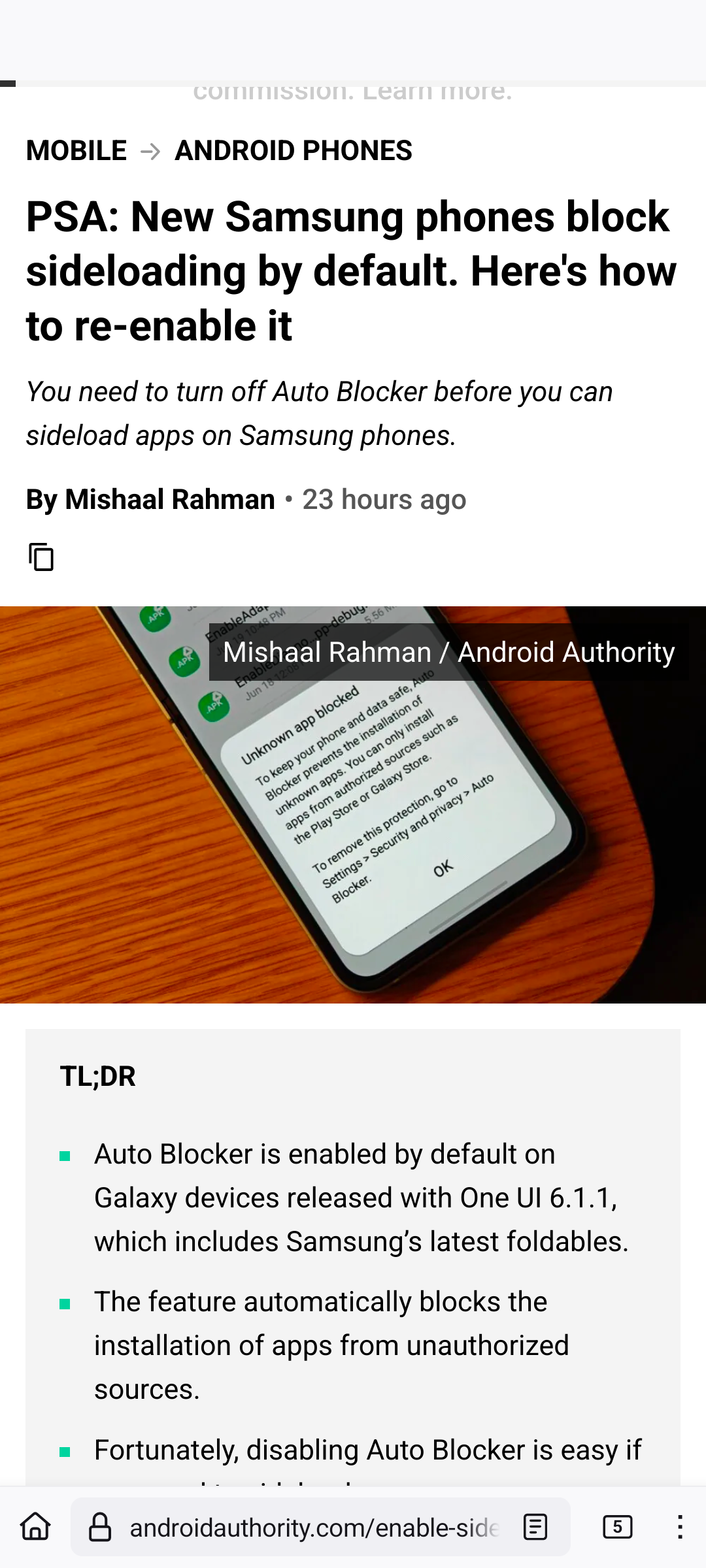
See, this is another thing broken in the current web. I made a usercss (Stylus) to normalize font size for certain elements and it works reasonably well. But on this site, it looks like this.

Anyone has a guess why, something with viewport or other meta tags?
Edit: fixed, they use a custom font with weird size settings. Looks like this now (with my normalize usercss).

As a web dev we do try to accommodate userCSS for accessibility reasons but often font sizes are tuned to what they are for a reason. I’d guess there’s a line height issue here.
You mean that their font was customized to display a certain size, for whatever reason?
Right,
browser.display.use_document_fonts = 0fixed it, lol.
Maybe a fixed line-height?
But my usercss enforces font-size: medium for <p> elements but this looks more like x-large. And it works well for 99% of pages.
Font-size and line-height are different properties


