Where’s the button to set default comment sorting?
It’s the 3 differently sized horizontal lines in the top right corner that appear when a post is opened. Very confusing placement but it is what it is.
Where do you suggest we should place it?
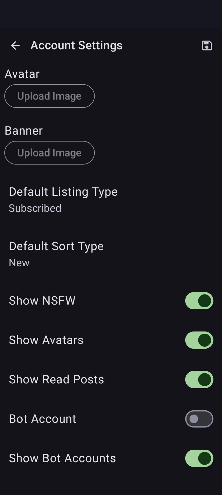
In the settings where you set your default post sorting.
Idk. Tbh just putting it in settings sounds like the best idea if you don’t want to create a separate space between the post and the comment section. Having it at the top looks like it has something to do with fonts or the post itself.
I agree, just in the settings is fine for the default. I’ve wanted this since day one.
Well advanced users who want to switch the modes every minute won’t like it but for most people better UI is more important.
Wouldn’t they still be catered for? The toggle can stay where it is, just have the default as an option in settings.
What I think is that the toggle shouldn’t be where it is because it’s poor and confusing design. The devs should change it at some point.
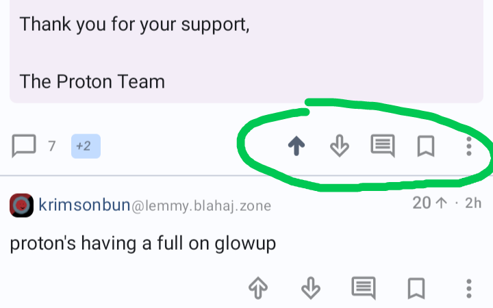
maybe here?

That is only temporary though and does not set the default.


