Currently, I have to manually schedule the posts for communities based on mods’ requests, and I understand that this isn’t a good thing to sustain in the long run. Hence, I have made up my mind to create a UI for this feature instead so all community mods can schedule their own posts!
This is only the initial ideation, and the final result may differ. The second scheduler design has some UI components reordered, but most of the idea remains the same.
I will try to add useful tooltips so you don’t have to keep clicking on the help button for instructions
Please give your opinion on the following:
- Is there any UI component that is difficult to understand or feels unnatural to you? Is there any naming convention that feels unnatural?
- If you are a site admin or a mod of multiple communities, would you prefer to manage all scheduled posts within a single screen, or manage them by community? Which one makes more sense to you?
P.S. I do have plans for more tweaks/enhancements for the bot and other future features(when we need them) but I will work on things based on their rank of importance. I think this feature will be quite helpful to community mods(as one of the mods were confused last time on how to get posts scheduled for their community) so I decided to work on this next :) P.S.S. MonyetPanel will have more features in the future too, but releases may take a very long time as this is currently mostly a one-man project by me.
Meanwhile, my userscript project is languishing 😭

Basically I want to keep everything clientside, posting on behalf of the user, using the user’s auth jwt. I think I’m going to go the web extensions route with it some day to leverage service workers*.
Anyway, back on topic. As you can see, I prefer tables, the supreme data viz, for the dashboard. Even Windows Task Scheduler uses tables.
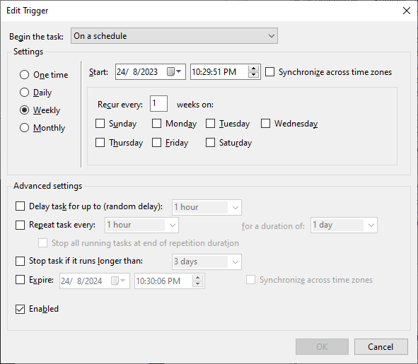
You could also present them like a post in a lemmy timeline, wysiwyg-style, toggleable/selectable somewhere.On how to present the schedule interval dialog, you can take inspiration from Task Scheduler as well:

And lastly, more template string support with external source selection (e.g. a db/excel + sql query or some other way to select the correct record), is much appreciated.
But eh, don’t take advice from me, a non-user.
edit: * thinking about it, a web app would work just as well. Sucks that I lose zeal/interest too quickly.
Haha, thanks for the suggestion on the scheduler interval thingy. I forgot monthly threads could be a thing too, or even biweekly! I don’t think I’ll need that much customizations though, but I definitely realized a ‘disable/enable’ option was missing(users can delete but what if they still want to keep it?)
I’m not a huge fan of table/excel style UI haha, the company I’m working at uses that but it’s really not my style.
table/excel style UI
I’m old skool like that 😎 thankfully modern frameworks e.g. bootstrap makes tables look serviceable, and also easier to cater to user customizations unlike company internal sites with their 90s HTML tables 🤢


